I am working as a Product Designer on a project for an after-school enrollment program – Luppo System
I am working on the intuitiveness and readability of the system. In this article, I will describe how I came to improve the readability of the menu. I invite you to read!
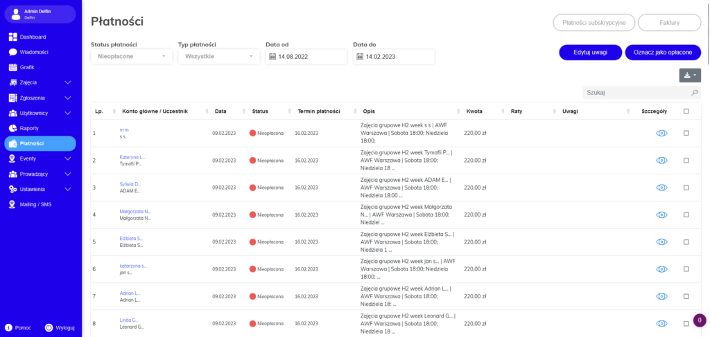
There is a payment button in the side menu. However, it was very illegible because it did not indicate whether these payments were for fees for the system or perhaps for the activities of their clients.
Customers also often asked where they can find invoices that were issued to them for using the system.
When I collected feedback from customers, I looked at this button and noticed a few errors:
All information about payments (both those made by customers and those that had to be paid by the system administrator) was in one place
The button informing about invoices was completely invisible
The ability to pay the fee for using the system was unclear and confusing for users

