Working as a Product/UX Designer, I am in constant contact with customers. When showing them the system each time, I look at their reactions and listen to what they say to me.
After more than a dozen meetings and conversations, I’ve noticed that customers can’t find the settings, which are global.
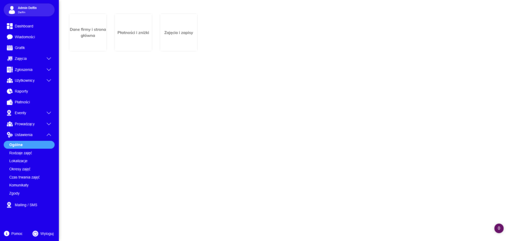
Here’s what the settings looked like before the changes. As you can see, the settings button expanded into several other smaller buttons that contained more. Their appearance did not encourage people to explore them either. They caused frustration in customers.
Below I’ve posted a video showing the path customers had to take before adding activities to the calendar. Pay particular attention to how many times I had to click on the settings button due to the lack of a return button and how many hidden functions were in each button.

I started digging into the topic and created an Information Architecture of the current setup using the XMind tool. It allowed me to visualize how deep customers need to look for an item of interest.
It turned out that as the System evolved, new settings were added to the previous ones which created chaos. I decided to improve their readability a bit and created a low-fi mockup to show how we could streamline the settings

